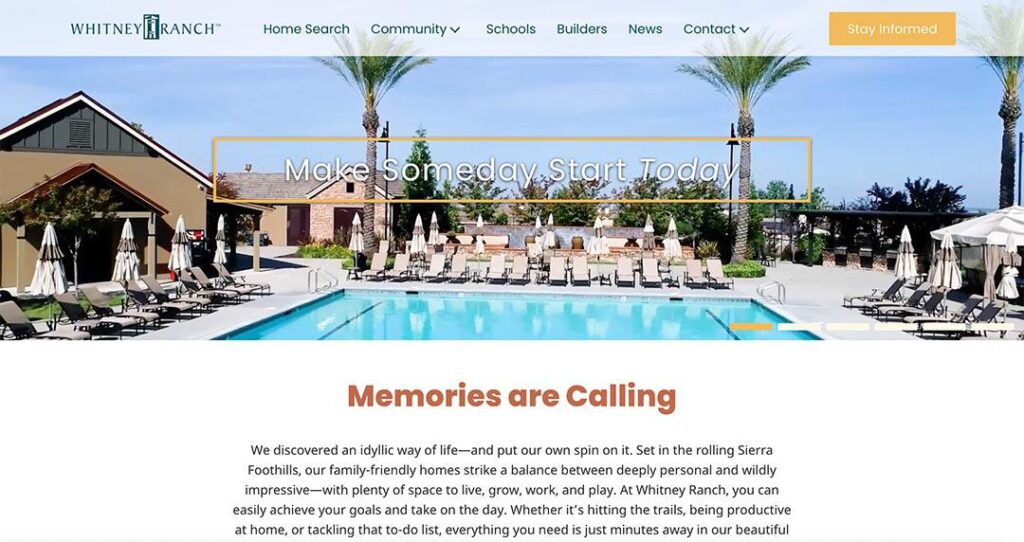

At Get Community (GC), updating clients’ websites is an essential part of ensuring their brand stays fresh in the eyes of visitors (potential home buyers). Making small changes like adding new copy, posting updates, swapping out photos, etc. may seem minor, but all of these activities are vital to a site’s ongoing performance. Recently, we developed an entirely new website for a gorgeous master-planned community in Rocklin, Whitney Ranch. Here’s a snapshot of our process:

Act I: The Proposal
The project began when Taylor Builders purchased Whitney Ranch and wanted to make major changes to both the front and backend of the site. In addition to updating the look, feel, and performance of the site, one of their central goals was to transition to a website-building software that would allow for more freedom when they eventually began focusing on resales after the community sells out.
The old website was developed using a web builder that offered less flexibility when it came to customization and personalization. This dilemma prompted GC’s decision to create a fresh website using WordPress, which is significantly faster, more customizable, and offers full control of a site’s code structure.
Using a platform like WordPress, along with hosting the site on an independent server, allows us to code a custom look for the website and to optimize its performance without the need of third-party developers to make changes using their own system. In other words, whenever GC or the client wants to alter something, it is much quicker and easier.
Beyond switching to WordPress, Taylor Builders requested that the new site:
- Emphasize the community and lifestyle of Whitney Ranch
- Promote action over information (generate leads and not overwhelm with information)
- Accommodate mobile devices
- Feature a lighter, more comfortable feel
Once we knew what the client was envisioning, our next step was to conduct research to help us develop a competitive website that is as beautiful and modern as it is functional and easy to navigate.
Act II: Research
GC began its research for the new Whitney Ranch website by reviewing data and insights gleaned from the previous website. When Whitney Ranch first opened, the target audience was primarily middle-aged homebuyers interested in purchasing a home in Rocklin. More recently (and especially within the last year), the community has experienced a significant rise in younger, first-time homebuyers looking to live east of the Bay Area. Thus, the site needed to appeal to this new audience of homebuyers, without alienating older buyers.
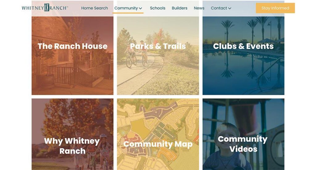
GC also discovered that visitors had been spending a good portion of their time on the old site’s Community pages. The data Sitemap Tree (below) shows how browsers generally visited these Community pages more often and spent more time viewing them in comparison to other areas of the website. This finding fueled our decision for the new site to emphasize the parks, clubhouse, and events that make up the wonderful community of Whitney Ranch.

GC also conducted competitive research that focused on direct competitors and the websites of other builders. We reviewed the similarities between layouts, design elements and details, and opportunities for improvement. For instance, by exploring competitors’ mobile sites, we observed the importance of organizing a hierarchy of information that pushes the most important information to the top of the page. This enables browsers to see this information, even if they don’t explore the entire page. We also noted how the number of menu tabs should be based upon the size of the mobile device being used, and that including a Contact button on every page helps generate more mobile conversions.
Act III: Implementation
With data informing our decisions, it was time to begin building the site. Our Mobile-First Design Process uses an iterative method to build and test different versions of a website across varying device sizes.
The main steps for the Whitney Ranch site involved 1) the design team creating several distinct landing pages so the client could select a visual direction, 2) the design team refining the selected option, building a mobile version of that page, and mocking up other pages in the same style, 3) the design and development teams working together to create a functioning prototype of the pages, and 4) the two teams working in coordination by writing copy and building the remaining pages in tandem. The entire process effectively allowed us to test the site’s features and view its design in real-time. This made it much easier for the developers to adjust elements across the site or tweak individual pages when requested by the designers.
Here is a list of the major changes we made, along with our rationale for each alteration:
- Expand the Community page (shown below), since that’s where browsers focus their interest
- Add a Fly Tour of the community for people who have difficulty scheduling an in-person tour
- Make the Contact section more intuitive by reducing the steps it takes for people to sign up
- Update the site’s layout to feel more modern and its content to be more concise
- Deepen the color palette to look more sophisticated and appeal to a new demographic of driven, young professionals
- Include a Contact form on every page to make the option of signing up simple and accessible
- Include important tabs in the main navigation bar to help browsers easily explore the site
- Improve the speed of the site by loading images in the background, which allows users with slow internet connections to read content without waiting for a page to load
- Incorporate a sliding banner that allows for the inclusion of multiple headers with their own keywords
- Address the security risks that come with WordPress by installing a firewall and making sure every page uses a secure connection

After these changes were made, we embarked on the task of data migration and transferred around 200 blog posts and images from the old site to the new one. Once Taylor Builders approved the new website, we launched it.
Act IV: Results
Data collected since the new Whitney Ranch website went live shows that all of our hard work is paying off!
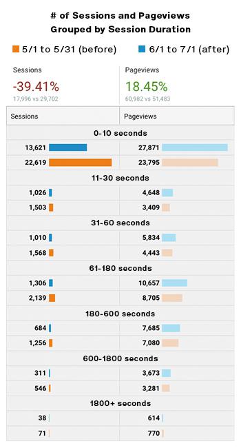
The bounce rate for the site has decreased by 22%, meaning that more people have been taking a secondary action (like clicking to a different page) before leaving. Crucially, we have also seen a 15% increase in pages visited per session, exhibiting that the site’s internal linking has strengthened — which also means visitors are more interested in exploring the website.
The following graph shows that the new web traffic views, on average, increased by 18% more pages. In other words, we accomplished our goal of encouraging visitors to check out more pages while they are browsing the website.

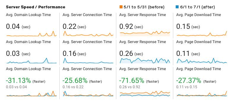
The data also shows that the website is performing faster than before. These shorter load times make it less likely that people will abandon the site before exploring it or participating in a conversion event, like signing up for the Interest List.
We increased the site’s speed by 1) moving to a mobile-first development process, and 2) transitioning from a server that was hosting multiple sites to a server dedicated to the Whitney Ranch site. Overall, server delay times have been reduced by about 30%.

Finally, our organic impressions (people landing on our site without being directed there by targeted ads) increased by 2%, which points to how the improved SEO has helped generate more organic traffic.
Epilogue
The outstanding web development and design teams at GC produced a product that is not only aesthetically pleasing but more user-friendly and effective at retaining visitors’ attention. You can check out the new and improved Whitney Ranch website for yourself by clicking here.
If you’re interested in giving your company’s website a makeover, you can always contact us. We can’t wait to collaborate with you and create something amazing!